.svg)
Keeping Pharmacists in Control, Bin by Bin
Making medication quantities and errors easier to check
Omnicell · Senior Product Designer
A single medication can be stored in several bins within an Omnicell cabinet. Pharmacists need to decide how much belongs in each bin and check that those quantities add up to the amount they intend to stock.
I was designing a feature that would give them more control over those quantities. The proposed automatic distribution could leave individual drawers over- or underequipped. Pharmacists needed to see exactly where the medication would go and make changes themselves.
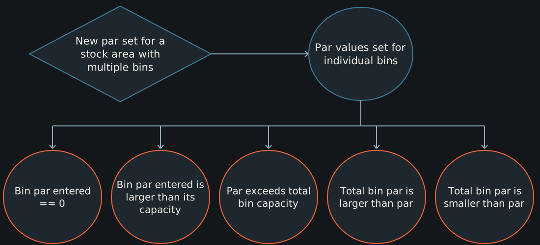
I mapped the possible errors, worked through the concerns with the team, and redesigned the configuration flow.
Let pharmacists decide where the medication goes
I looked at the configuration task alongside the broader medication journey I’d already mapped. Then I mapped the ways a quantity change could leave the inventory different from what the pharmacist intended.
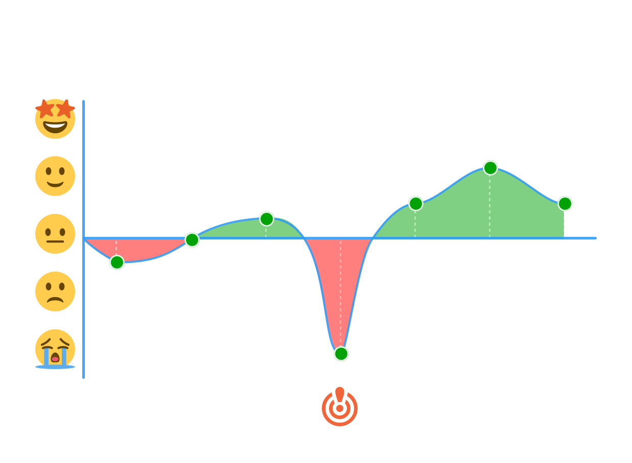
I took those flows to our internal subject-matter experts, brought them to design critique, and walked through the risks with the team. We agreed to change the proposed interaction.
The revised design asked pharmacists to distribute the quantities manually. That added a step, but it was a step I wanted to keep. Pharmacists needed to know what they were approving, and the interface needed to show them when the numbers didn’t agree.
Bring the quantities together
The existing design put everything in a narrow sidebar. The cabinet-level quantities were near the top, while the bin information sat farther down. Pharmacists would have to move between sections to check numbers that belonged together.
I went through about 15 iterations to get the bin quantities next to the total. In the selected design, the individual bins sat beneath the overall maximum, with a shared place for error messages.
A little friction, more control
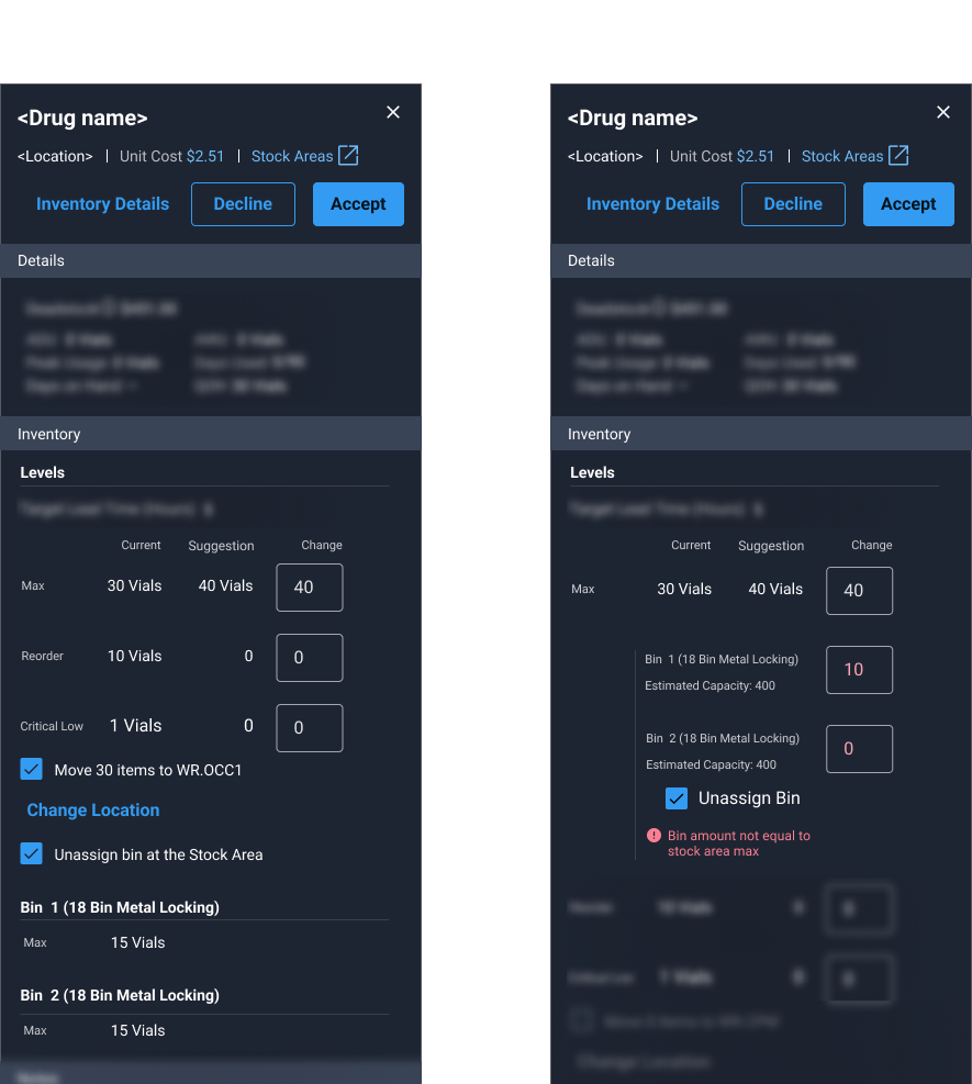
You can see the issue in the example above. A maximum of 40 sits above bin entries of 10 and 0. The error underneath explains that the bin amounts don’t equal the stock-area maximum. The pharmacist can see the total, the allocations, and the problem in the same place.
I built the new components in Figma and documented them for engineering handoff and reuse in the design system.
Allocation error states.
From wishlist to workflow.
I interviewed account representatives, support specialists, and subject-matter experts, then worked their many requests into a clear flow. Our design system constrained us to a tiny sidebar. I’d already designed a stepper to break up the work, but time constraints meant it had to wait.

The sidebar redesign was the immediate deliverable.
Where I left it
I finished the revised allocation flow and component documentation, with the approach reviewed by internal subject-matter experts and agreed on by the team.
My involvement ended before I could see the design launch or observe pharmacists using it. We wanted to reduce configuration errors and make better use of drawer space, but I don’t have results for those goals. What I could hand over was a design that kept the allocation decisions visible and gave pharmacists a way to check their work.
Want to discuss this project? Contact Joe at josephnewell90@gmail.com.
